The Future of Analytics and Reporting: Trends to Watch.

Analytics and reporting have come a long way since their inception, and they continue to evolve at a rapid pace. In this blog post, we’ll explore the future of analytics and reporting and the trends to watch.

The Future of Analytics and Reporting: Trends to Watch.

Predictive analytics: Predictive analytics uses statistical techniques and machine learning algorithms to analyse historical data and make predictions about future outcomes. With the increase in big data and advancements in technology, predictive analytics is set to become even more prevalent in the future.

Real-time analytics: Real-time analytics enables organisations to analyse data as it’s generated, allowing them to make decisions in real-time. With the increase in the Internet of Things (IoT) and connected devices, real-time analytics is becoming a necessity rather than a luxury.

Natural language processing: Natural language processing (NLP) enables machines to understand and interpret human language. This technology is already being used for chatbots and virtual assistants, but it has the potential to revolutionise analytics and reporting. With NLP, users can ask questions in plain language and receive answers in real-time.

Automated reporting: Automation is already being used in many areas of business, and reporting is no exception. Automated reporting enables organisations to generate reports quickly and accurately, saving time and resources.

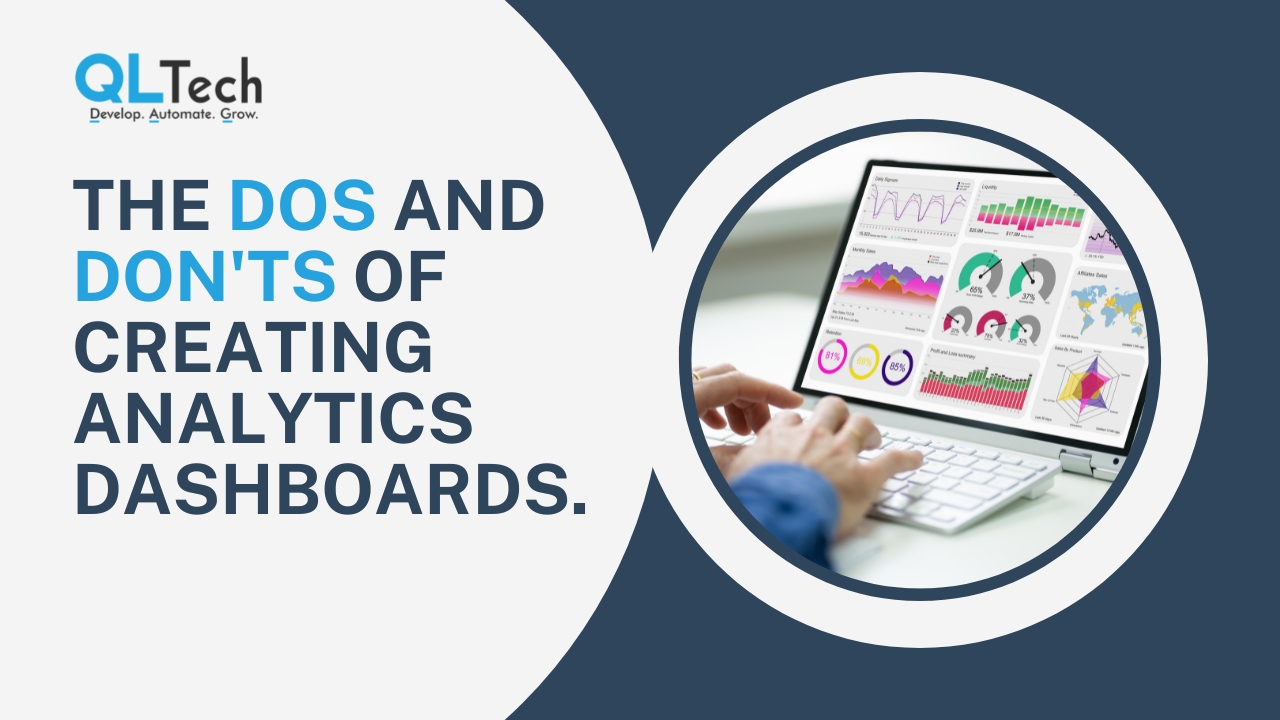
Data visualisation: Data visualisation is the graphical representation of data and information. It’s a powerful tool for communicating complex information and insights quickly and clearly. In the future, we can expect to see more advanced data visualisation tools that make it even easier to interpret and understand data.

Augmented analytics: Augmented analytics uses machine learning algorithms and artificial intelligence to automate data preparation, analysis, and insights generation. This technology has the potential to revolutionise the way we approach analytics and reporting, making it faster, more accurate, and more accessible.

Data security: As the use of data continues to grow, data security will become an even more significant concern. Organisations will need to take measures to ensure the security and privacy of the data they collect and analyse.

Personalisation: Personalisation is already being used in marketing and advertising, but it has the potential to be applied to analytics and reporting as well. With personalisation, users can get insights and reports tailored to their specific needs and preferences.

Collaborative analytics: Collaborative analytics enables teams to work together on data analysis and reporting. This technology is set to become more prevalent in the future, enabling organisations to make better use of their collective expertise and knowledge.

In conclusion, the future of analytics and reporting is bright, with many exciting trends to watch. Predictive analytics, real-time analytics, natural language processing, automated reporting, data visualisation, augmented analytics, data security, personalisation, and collaborative analytics are all set to transform the way we approach data analysis and reporting. By staying up-to-date with these trends, organisations can stay ahead of the curve and make better-informed decisions.

Join our community and never miss an update! Subscribe to our newsletter and blog to stay up-to-date on the latest trends, tips, and insights in your area of interest. Don’t miss out on exclusive content, promotions, and special offers. Sign up now and be a part of our growing community!

The Dos and Don’ts of Creating Analytics Dashboards

Analytics dashboards are an essential tool for visualising complex data and making informed business decisions. However, not all dashboards are created equal. Effective dashboards must be designed with the user in mind, presenting data in a clear and accessible format that supports decision-making. In this blog post, we’ll explore the dos and don’ts of creating analytics dashboards.

The Dos and Don'ts of Creating Analytics Dashboards

Dos:

Identify your audience: Before creating a dashboard, it’s important to understand who will be using it. Identify the stakeholders, decision-makers, and end-users, and design the dashboard to meet their specific needs.

Use clear and concise language: Avoid using technical jargon or complex terminology that could confuse users. Use plain language that is easy to understand and communicates the key insights.

Focus on key metrics: Keep the dashboard focused on the most important metrics, rather than overwhelming users with too much information. Highlight the key performance indicators (KPIs) that matter most to your audience.

Visualise data effectively: Use charts, graphs, and other visual aids to make the data more accessible and easy to understand. Choose the right visualisations for the type of data you’re presenting, and make sure they are clear and easy to read.

Provide context: Help users understand the data by providing context around the metrics. Use annotations, callouts, and other tools to provide additional information and insights.

Make it interactive: Enable users to interact with the data by including filters, drop-downs, and other interactive elements. This allows users to explore the data and gain deeper insights.

Use a consistent design: Use a consistent design across all dashboards to ensure a consistent user experience. Use the same color schemes, fonts, and layouts to make it easy for users to navigate and understand the data.

Don’ts:

Overcomplicate the dashboard: Avoid overcomplicating the dashboard with too much data, complex visualisations, or unnecessary features. Keep it simple and focused on the key metrics.

Use too many colors: Avoid using too many colors, as this can make the dashboard look cluttered and confusing. Stick to a simple color palette that is easy on the eyes.

Neglect mobile users: Make sure the dashboard is optimised for mobile devices, as more and more users are accessing data on their smartphones and tablets.

Use too much text: Avoid using too much text, as this can overwhelm users and make the dashboard look cluttered. Use charts and other visualisations to communicate the data, and keep the text concise.

Forget about data quality: Ensure that the data is accurate, consistent, and up-to-date. Use data cleansing tools to remove any errors or inconsistencies that could impact decision-making.

In conclusion, creating an analytics dashboard requires a user-centric approach, clear and concise language, focused key metrics, effective data visualisation, contextual insights, interactivity, and a consistent design. Avoid overcomplicating the dashboard, using too many colors, neglecting mobile users, using too much text, and forgetting about data quality. By following these dos and don’ts, you can create dashboards that provide valuable insights and drive informed decision-making.

Join our community and never miss an update! Subscribe to our newsletter and blog to stay up-to-date on the latest trends, tips, and insights in your area of interest. Don’t miss out on exclusive content, promotions, and special offers. Sign up now and be a part of our growing community!